How to Generate Color Swatches for Your Design System
Learn to generate systematic color swatches for design systems. Create scalable color libraries with primary, secondary, and semantic colors that maintain consistency across your entire product.
Color swatches are the foundation of any design system. They define not just which colors to use, but how those colors scale across different contexts: primary buttons versus secondary buttons, warning states versus error states, dark mode versus light mode. A well-generated swatch system eliminates inconsistency and speeds up every future design decision.
This guide explains how to generate comprehensive color swatches for design systems, from establishing base colors to creating systematic scales and semantic variations. Whether you are building a new design system or refining an existing one, these principles ensure your color library serves your product effectively.
What Color Swatches Are
Color swatches in design systems are more than individual colors. They are organized collections with clear relationships, scales, and usage rules. Understanding the structure helps you generate more useful swatch libraries.
Base colors
Base colors are your core brand colors at their most natural expression. These are the pure hues before any tints or shades are applied. A typical design system has one to three base colors: a primary brand color, a secondary accent, and sometimes a tertiary option.
Color scales
Each base color expands into a scale of lighter and darker variations. Common scales run from 50 (lightest) to 900 (darkest), with the base color typically at 500. This systematic approach provides options for every use case while maintaining visual coherence.
Semantic colors
Semantic colors communicate meaning: success (green), warning (yellow/orange), error (red), info (blue). These colors need their own scales for different states and contexts. A success color might need light backgrounds, medium text, and dark icons.
Neutral scales
Neutrals (grays, whites, blacks) often need the most variations. Text colors, backgrounds, borders, and dividers all use neutral tones. A complete neutral scale might have fifteen or more steps to cover all UI needs.
Starting with Base Colors
Generating effective swatches starts with choosing the right base colors. These foundational choices determine everything that follows.
Generating base colors
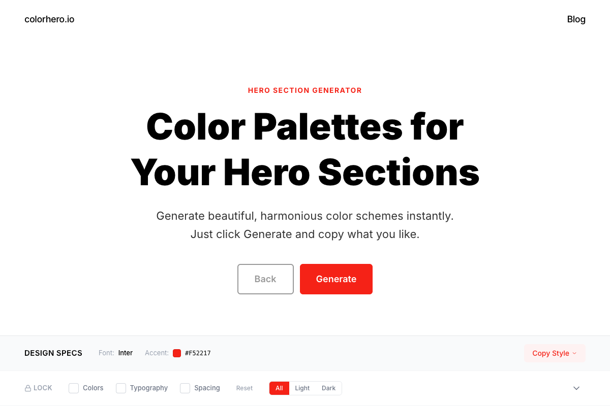
Use a palette generator to establish harmonious base colors. Colorhero generates hero section palettes with background, accent, and text colors that work together. These can serve as starting points for a broader design system.
Generate base colors with Colorhero →
Extracting from brand guidelines
If you have existing brand colors, start there. Take your primary brand color as the base for your primary scale. Secondary brand colors become bases for additional scales. Ensure these colors work on screen, as print colors often need adjustment for digital use.
Testing base colors in context
Before generating scales, test base colors in actual UI contexts. Can you read text over this background? Does this accent stand out against the background? Does this combination feel right for your brand? Adjust base colors now rather than rebuilding scales later.
Generating Color Scales
Once base colors are established, generate systematic scales for each. Several approaches produce usable results.
Lightness-based scaling
The most common approach adjusts lightness while keeping hue and saturation relatively constant. Start with your base color, then create variations at fixed lightness intervals. Tools like the HSL color model make this straightforward.
- Keep hue constant across the scale
- Adjust lightness in consistent steps
- Slightly reduce saturation at extreme light and dark ends
- Verify each step remains visually distinct from neighbors
Perceptual uniformity
Human color perception is not linear. Two colors that appear equally different in HSL values may not look equally different to human eyes. Advanced approaches use perceptually uniform color spaces like OKLCH to create scales that feel evenly distributed.
Manual refinement
Algorithms provide starting points, but manual refinement often improves results. Look at your generated scale and adjust individual steps that feel too similar to neighbors or that have unwanted color shifts. Trust your eyes over mathematical precision.
Semantic Color Systems
Semantic colors communicate meaning consistently across your product. Generating them requires balancing universal conventions with brand consistency.
Success colors
Success typically uses green tones. Generate a green scale for success states: light backgrounds for success banners, medium tones for icons and text, dark tones for borders or emphasis. Ensure your success green is distinguishable from any green in your brand palette.
Warning colors
Warning states use yellow or orange tones. Yellow requires careful handling because it has the least contrast against white backgrounds. Generate a scale and verify contrast at every step. You may need to shift toward orange for better accessibility.
Error colors
Error states use red tones. Red carries strong emotional weight, so balance visibility with appropriate intensity. Very bright reds can feel aggressive. Slightly desaturated reds often work better while still communicating urgency.
Info colors
Information states typically use blue tones. Since blue often appears in brand palettes, ensure your info blue is distinguishable from primary blue. A different shade or slight hue shift prevents confusion between brand elements and informational states.
Neutral Scale Generation
Neutrals require more variations than any other color category. Text, backgrounds, borders, shadows, and disabled states all rely on neutral scales.
Pure gray vs tinted gray
Decide whether your neutrals should be pure gray or tinted with your brand color. Pure grays feel more clinical. Warm-tinted grays (toward beige) feel approachable. Cool-tinted grays (toward blue) feel modern and technical. Match the tint to your brand personality.
Extended neutral range
While color scales often have nine to eleven steps, neutral scales may need fifteen or more. The distinction between disabled text and secondary text, or between card backgrounds and page backgrounds, requires subtle differences that only extended ranges provide.
Dark mode neutrals
Dark mode requires its own neutral scale. Simply inverting your light mode grays rarely works well. Generate separate dark mode neutrals that feel natural with light text and maintain proper contrast relationships.
Accessibility in Color Swatches
Every combination in your swatch system must meet accessibility standards. Building accessibility into the generation process prevents painful revisions later.
Contrast requirements
WCAG requires 4.5:1 contrast for normal text and 3:1 for large text. When generating scales, note which combinations meet these thresholds. Document approved pairings so designers do not have to check contrast every time.
- 4.5:1 minimum for normal text (under 18pt)
- 3:1 minimum for large text (18pt+ or 14pt bold)
- 3:1 minimum for UI components and graphical elements
- Document all approved contrast pairings
Color blindness consideration
Approximately 8% of men have some form of color blindness. Test your swatches with color blindness simulators. Ensure critical distinctions like success vs error do not rely solely on green vs red differentiation.
Semantic pairing guidance
For each semantic color, specify which steps work for text on white, text on dark, backgrounds for banners, and icon usage. Pre-approved pairings speed up design work and prevent accessibility failures.
Common Color Accessibility Mistakes and How to Fix Them →
Organizing Your Swatch Library
How you organize swatches affects how easily designers can use them. Clear structure and naming conventions make the difference between a useful system and a confusing one.
Naming conventions
Use consistent, semantic naming. Primary-500 is clearer than blue-base. Success-light is more useful than green-100. Names should communicate purpose, not just appearance. When the primary color changes, you update one definition rather than renaming everything.
- Use role-based names: primary, secondary, success, error
- Use numbered scales: 50, 100, 200... 900
- Avoid color names in tokens: blue-500 becomes brittle
- Include usage hints: text-primary, bg-surface
Token structure
Design tokens translate swatches into usable variables. Structure tokens in layers: base colors, semantic colors, and component-specific colors. This hierarchy allows global changes while maintaining flexibility for specific overrides.
Documentation
Document each swatch with its hex value, approved pairings, and usage guidelines. Show examples of correct use and common misuse. Good documentation prevents misapplication and reduces questions from team members.
Exporting to Design Tools
Generated swatches need to reach design tools and codebases. Different export formats serve different needs.
Figma and design tools
Most design tools accept hex codes or RGB values. Some support importing entire color libraries. Structure your swatches as named styles that designers can apply consistently across files.
CSS custom properties
Export swatches as CSS custom properties (variables) for web development. This format allows easy theme switching and maintains consistency between design and code. Name variables to match your design token structure.
JSON for design systems
Design token tools like Style Dictionary consume JSON-formatted color definitions. Export your swatches in structured JSON that these tools can transform into any output format needed.
How Developers Can Quickly Build Beautiful Color Systems →
Maintaining Swatches Over Time
Color systems evolve. New features need new colors. Brand updates require palette adjustments. Plan for maintenance from the start.
Version control
Track color changes in version control alongside code. When swatches change, the history shows what changed and why. This trail helps diagnose issues and supports rollbacks if needed.
Change management
Establish a process for proposing and approving color changes. Ad-hoc additions lead to bloated, inconsistent systems. Regular review keeps the palette focused and purposeful.
Deprecation strategy
When removing colors, deprecate before deleting. Mark colors as deprecated, provide migration guidance, and give teams time to update before removal. This prevents breaking changes and maintains trust in the system.
Tools for Swatch Generation
Several tools help generate systematic color swatches. Each has different strengths.
Colorhero for starting points
Colorhero generates harmonious base palettes quickly. Use it to establish your primary and accent colors before expanding into full scales. The role-based output translates directly to design system foundations.
Scale generators
Tools like Leonardo Color and Scale generate systematic scales from base colors. Input your base, specify the number of steps, and receive a complete scale. Test results carefully as algorithms do not always produce perceptually uniform distributions.
Design system tools
Comprehensive tools like Figma Tokens and Style Dictionary help manage entire color systems. They combine generation with organization, documentation, and export. These are particularly valuable for large teams and complex products.
FAQ
How many swatches does a design system need?
A minimal system might have 50-60 swatches: primary scale (9-11), secondary scale (9-11), four semantic scales (36-44), and neutrals (15+). Complex systems can have hundreds. Start minimal and add as genuine needs arise rather than generating everything upfront.
Should I generate swatches manually or use tools?
Use tools for initial generation, then refine manually. Algorithms provide mathematically correct scales that may not be perceptually optimal. Your eyes catch issues that formulas miss. The combination of automated generation and human refinement produces the best results.
How do I handle brand color updates?
If your system uses semantic naming (primary instead of blue), brand color updates affect only the base definitions. All usages of primary automatically update. This is why role-based naming is essential for maintainable systems.
Do I need different swatches for dark mode?
Usually yes. Simply inverting light mode colors rarely works well. Dark mode often needs adjusted saturation, different neutral tints, and modified semantic colors. Generate and test dark mode swatches separately rather than deriving them automatically.
How often should I review my color system?
Review quarterly or when major features ship. Look for unused colors to remove, missing colors that teams keep requesting, and consistency issues that have crept in. Regular maintenance keeps systems healthy and prevents bloat.
Start Building
Systematic color swatches are the foundation of consistent, scalable design. Start with harmonious base colors, generate thoughtful scales, and organize everything with clear naming and documentation. The upfront investment pays dividends in faster, more consistent design work.
Generate base colors with Colorhero →
Creating Website Consistency With a Simple Color System →
How to Build a Brand Color System in One Hour →
Clean UI Color Systems for SaaS and Web Apps →
Try Colorhero
Colorhero generates harmonious base palettes perfect for starting design systems. Get background, accent, text, and secondary text colors that work together, then expand into full swatch scales. Every generated palette is contrast-verified and ready for systematic expansion.