The Complete Guide to Website Color Design
A comprehensive guide covering everything you need to know about website color design, from fundamentals to advanced implementation. Learn color theory, psychology, accessibility, and practical techniques.
Color is one of the most powerful tools in web design. It influences emotions, guides user behavior, builds brand recognition, and determines whether visitors stay or leave within seconds. This comprehensive guide covers everything you need to know about website color design, from foundational theory to advanced implementation techniques.
Whether you are a complete beginner learning to choose your first palette or an experienced designer looking to deepen your expertise, this guide provides both the foundational knowledge and advanced techniques for creating effective, accessible, and beautiful color systems.
Part 1. Color Fundamentals
Before diving into website-specific applications, understanding core color theory provides the foundation for all design decisions. These principles have guided artists and designers for centuries, and they apply directly to digital interfaces.
The Color Wheel
All color theory begins with the color wheel, a visual representation of how colors relate to each other. Originally developed by Isaac Newton in 1666, the color wheel remains the most useful tool for understanding color relationships.
Primary colors form the foundation: red, yellow, and blue. These cannot be created by mixing other colors. Secondary colors emerge from mixing two primaries: orange (red + yellow), green (yellow + blue), and purple (blue + red). Tertiary colors sit between primaries and secondaries, creating the full spectrum.
Understanding the wheel helps you identify which colors naturally complement or contrast with each other. Colors opposite each other create high contrast, while adjacent colors feel harmonious and cohesive.
Color Properties: Hue, Saturation, and Lightness
Every color has three distinct properties that you can adjust independently. Mastering these gives you precise control over your palette.
- Hue: The color itself, such as red, blue, or green. This is what most people think of as color.
- Saturation: The intensity or vividness of the color. High saturation appears vibrant, low saturation appears muted or grey.
- Lightness (Value): How light or dark the color is. Adding white increases lightness, adding black decreases it.
The HSL (Hue, Saturation, Lightness) color model gives you independent control over each property. This is often more intuitive than RGB for design work because you can adjust brightness without accidentally shifting the hue.
Color Temperature
Colors are categorized as warm or cool, a distinction that profoundly affects mood and perception.
Warm colors include reds, oranges, and yellows. They advance toward the viewer, create energy, and evoke feelings of warmth, excitement, or urgency. Cool colors include blues, greens, and purples. They recede from the viewer, create calm, and evoke feelings of professionalism, trust, or tranquility.
Most effective color schemes combine warm and cool elements. A predominantly cool palette with warm accents creates visual interest while maintaining a calming overall feel. The reverse, warm dominance with cool accents, feels energetic yet balanced.
Color Relationships and Harmony
The color wheel reveals four primary relationship types, each creating distinct visual effects.
- Complementary: Colors opposite each other on the wheel. Creates maximum contrast and visual tension. Blue and orange, red and green.
- Analogous: Colors adjacent on the wheel. Creates harmony and cohesion. Blue, blue-green, and green.
- Triadic: Three colors equally spaced on the wheel. Creates vibrant variety while maintaining balance.
- Monochromatic: Variations of a single hue using different saturation and lightness. Creates unity and sophistication.
For website design, monochromatic and analogous schemes are safest. They create visual harmony naturally. Complementary schemes work well when one color dominates and the other serves as accent.
Part 2. Color Psychology in Web Design
Colors do not just look different. They feel different. Understanding color psychology helps you choose colors that reinforce your message rather than undermine it.
Emotional Associations by Color
Each color carries psychological associations that influence how visitors perceive your website. While individual responses vary, these associations are remarkably consistent across cultures.
Blue conveys trust, calm, professionalism, and reliability. It is the most universally liked color and appears in more corporate brands than any other. Use blue when you want visitors to feel safe and confident.
Green suggests growth, nature, health, and prosperity. It works well for environmental brands, financial services, and wellness products. Green is also the easiest color on the eyes.
Red creates urgency, passion, excitement, and danger. It grabs attention faster than any other color. Use sparingly for calls to action, sale announcements, or warning messages.
Orange combines the energy of red with the friendliness of yellow. It feels approachable, creative, and youthful. Purple suggests luxury, creativity, and wisdom. Black conveys sophistication, power, and elegance. White creates feelings of purity, simplicity, and space.
Industry Color Conventions
Different industries have established color expectations. Understanding these conventions helps you decide when to follow them and when to differentiate.
- Finance and banking: Blue, green, navy. Conveys trust and stability.
- Healthcare: Blue, green, white. Suggests cleanliness and calm.
- Technology: Blue, black, gradients. Implies innovation and reliability.
- Food and beverage: Red, orange, yellow. Stimulates appetite.
- Luxury and fashion: Black, gold, deep colors. Creates exclusivity.
- Children and education: Bright primary colors. Feels playful and accessible.
Breaking conventions can help you stand out, but it requires intention. A financial service using bright pink needs to work harder to establish trust. A toy company using only grey and navy loses playfulness. Know the rules before breaking them.
Cultural Color Considerations
If your audience spans multiple cultures, color associations may vary significantly. Research your specific markets.
White symbolizes purity in Western cultures but mourning in some Eastern cultures. Red signals danger in the West but luck and celebration in China. Green is associated with nature globally but holds religious significance in Islamic cultures. Yellow suggests happiness in the West but can indicate jealousy or caution elsewhere.
For global websites, focus on colors with consistent positive associations across cultures. Blue is the safest choice globally, which explains its dominance in international brands.
Part 3. Building a Color System
Individual colors matter less than how they work together as a system. A well-designed color system ensures consistency, accessibility, and scalability across your entire website.
The Four Essential Color Roles
Every website needs colors serving four distinct roles. Defining these roles creates a foundation for all color decisions.
- Background: The primary canvas color covering most of your page. Usually neutral like white, off-white, or dark grey.
- Text: Colors for body text, headings, and secondary text. Must contrast strongly with background.
- Accent: Your primary brand color used for calls to action, links, and highlights. Should stand out clearly.
- States: Semantic colors for feedback like success (green), warning (yellow), error (red), and info (blue).
With these four roles defined, you can build out your entire interface consistently. Every new element fits into one of these categories.
Creating a Systematic Palette
Start by choosing your accent color, as this is your primary brand identifier. Then build the supporting cast around it.
For each color role, create variations: lighter versions for backgrounds, standard for primary use, darker for hover states. A typical accent scale might include 100, 200, 300, 400, 500, 600, 700, 800, and 900 values from lightest to darkest.
Choose background colors that complement your accent without competing. If your accent is warm, consider a slightly cool neutral background. This subtle contrast adds sophistication.
Light and Dark Mode Support
Modern websites increasingly need both light and dark themes. Planning for both from the start is easier than retrofitting later.
In light mode, backgrounds are bright with dark text. In dark mode, backgrounds are dark with light text. Your accent color may need adjustment. A bright accent that works on white might feel harsh on dark backgrounds, requiring a slightly desaturated or lightened variant.
Create a complete mapping: every light-mode color needs a dark-mode equivalent. Use semantic naming like background-primary rather than background-white so the same token works in both modes.
Accessibility Requirements
Color accessibility is not optional. WCAG guidelines establish minimum contrast requirements that ensure readability for users with visual impairments.
- Normal text (under 18px): Requires 4.5:1 contrast ratio minimum
- Large text (18px+ or 14px+ bold): Requires 3:1 contrast ratio minimum
- Interactive elements: Must be clearly distinguishable from surrounding content
- Color cannot be the only indicator: Important information needs additional cues like icons or text
Test every color combination in your system. Free tools like WebAIM Contrast Checker make this straightforward. When in doubt, increase contrast.
Part 4. Practical Implementation
Theory becomes useful only when implemented correctly. Here is how to translate your color system into code and design files.
CSS Custom Properties
Define your colors as CSS custom properties (variables) at the root level. This enables easy theming and ensures consistency.
Structure your variables with semantic names. Instead of --blue-500, use --color-accent-primary. Instead of --grey-100, use --color-background-primary. This decouples color from usage, making theme changes trivial.
Design Tokens
For larger projects, implement a three-tier token system that scales across teams and products.
- Primitive tokens: Raw color values. blue-500: #2563EB
- Semantic tokens: Purpose-based names referencing primitives. color-accent: blue-500
- Component tokens: Specific usage referencing semantic tokens. button-background: color-accent
This hierarchy allows changing your brand color by modifying one primitive, with all semantic and component references updating automatically.
Color in Components
Apply colors systematically across component types. Consistency comes from following established patterns.
Buttons use accent colors with appropriate text contrast. Cards use surface colors slightly elevated from the background. Text uses your text color scale based on importance. Borders use subtle variations of your grey scale.
Every component should have defined states: default, hover, focus, active, and disabled. Each state uses variations from your color system, never arbitrary values.
Part 5. Common Patterns and Techniques
Certain color applications appear repeatedly across successful websites. Understanding these patterns accelerates your design process.
Hero Sections
Your hero section creates the first impression. Color here matters more than anywhere else on your site.
The safest approach uses a solid neutral background (white, off-white, or dark grey) with your accent color reserved for the call-to-action button. This ensures the button commands attention.
For more dramatic effect, try solid colored backgrounds with contrasting text. Or use subtle gradients that add depth without overwhelming content.
Hero sections with image backgrounds need careful contrast management. Ensure text remains readable by adding overlays or choosing image-free areas for text placement.
Navigation Color
Navigation typically uses neutral colors to avoid competing with page content.
On light sites, white or very light grey navigation works well. On dark sites, use matching dark tones or slightly lighter variants. Reserve accent colors for active states and hover effects only.
Form Design
Forms require clear state indication through color. Users must instantly understand what is happening.
- Default: Subtle borders, usually grey
- Focus: Accent color ring or border to show current field
- Valid: Green indicator confirming correct input
- Invalid: Red indicator with error message
- Disabled: Reduced opacity or greyed out appearance
Part 6. Advanced Techniques
Once you have mastered fundamentals, these advanced techniques add polish and sophistication to your color work.
Gradient Design
Modern gradients are subtle, serving as sophisticated backgrounds rather than attention-grabbing effects.
Same-hue gradients (light blue to dark blue) always work. Adjacent-hue gradients (blue to purple) usually work when saturation is similar. Distant-hue gradients (blue to orange) require careful handling and often appear dated.
Keep gradient transitions smooth with multiple color stops. Add slight desaturation to midpoints to prevent muddy appearance. Test gradients at various screen sizes, as what looks subtle at desktop scale may feel intense on mobile.
Color and Motion
Color transitions add life to interfaces when used purposefully.
Hover state transitions (200-300ms) feel responsive without being jarring. Loading indicators can pulse through accent variations. Focus states can animate smoothly to draw attention without startling.
Keep all color animations subtle and purposeful. Respect reduced-motion preferences for users who find animation disorienting.
Responsive Color Considerations
Colors may need adjustment across different contexts and user preferences.
- System dark mode: Automatically switch themes based on OS preference
- High contrast mode: Provide increased contrast for accessibility needs
- Print stylesheets: Adjust colors for paper output, typically removing backgrounds
- Different screen types: Test on various monitors as color reproduction varies
Build flexibility into your system from the start. Using CSS custom properties makes all these adaptations straightforward.
Part 7. Tools and Workflow
The right tools accelerate your color work and help avoid common mistakes.
Color Selection Tools
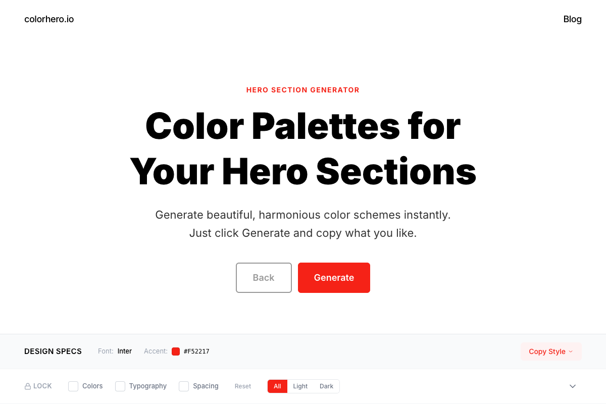
Colorhero generates complete hero section palettes with background, accent, and text colors that work together. Coolors offers random palette generation with the ability to lock colors you like. Adobe Color provides harmony rules based on color theory. Realtime Colors shows live preview of colors in context.
Try Colorhero for instant hero section palettes →
Contrast Checking
Always verify contrast ratios before finalizing color choices.
- WebAIM Contrast Checker: Free web tool for quick checks
- Stark: Figma and Sketch plugin for design-time checking
- Browser dev tools: Chrome and Firefox include contrast checking
- axe DevTools: Comprehensive accessibility testing including color
Design-to-Development Handoff
Clear documentation prevents color inconsistencies between design and implementation.
- Document every color: Exact hex values, semantic names, and intended usage
- Include variations: Hover states, dark mode equivalents, disabled states
- Provide context: When to use each color and combinations to avoid
- Note accessibility: Contrast ratios and any special considerations
Part 8. Common Mistakes to Avoid
Learning from common mistakes helps you avoid them in your own work.
Using Too Many Colors
Four to six colors plus semantic states is enough for any website. More creates visual chaos and makes establishing hierarchy impossible. If you need more colors, question whether you actually need them or are compensating for other design problems.
Inconsistent Application
The same role should mean the same color everywhere. If accent blue appears on your primary button, every primary button should use that exact blue. Create and rigorously follow a system. Random variation destroys user confidence.
Insufficient Contrast
Light grey text on white backgrounds remains the most common color accessibility failure. Test every combination. When in doubt, increase contrast. Trendy low-contrast designs often sacrifice usability for aesthetics.
Ignoring Device Context
Colors look different on different screens. That carefully calibrated blue on your designer monitor may appear greenish on a cheap laptop screen. Test on multiple devices, prioritizing the devices your audience actually uses.
Following Trends Blindly
Color trends come and go. Fundamentals remain. Understand why a trend works before adopting it. A trendy color scheme that conflicts with your brand message does more harm than an unfashionable scheme that reinforces it.
FAQ
How many colors does a website need
Four to six main colors plus semantic state colors (success, warning, error, info) is sufficient for almost any website. This includes background, text variations, and accent colors. If you think you need more, reconsider whether additional colors serve a purpose or create confusion.
Should I hire a designer for color selection
For complex brands, products with many states, or situations where brand consistency is critical, professional help is valuable. For simpler sites, systematic approaches using tools like Colorhero can produce excellent results without design expertise.
How do I choose between similar colors
Test in context rather than isolation. Place options in your actual design and live with them briefly. Often the choice becomes obvious once you see colors in use. Trust your gut response after a break from looking at them.
Can I change colors after launching my website
Absolutely. Color changes are among the easier design updates when you have a proper system in place. If using CSS custom properties, a rebrand can be as simple as updating variable values. Start with your best guess and iterate based on feedback.
What is the single most important color decision
Your accent color, the color used for primary calls to action and brand highlights. This color carries your brand identity and guides user attention. Get this right and build everything else around it.
How do I know if my colors are accessible
Use contrast checking tools to verify every text and background combination meets WCAG standards: 4.5:1 for normal text, 3:1 for large text. Also ensure color is not the only way you convey information, as color-blind users may miss it.
Start Creating Better Color Systems
Color mastery comes from practice. Start with the fundamentals, build systems rather than picking colors randomly, and always test your choices in real context.
Generate your first palette with Colorhero →
How to Build a Brand Color System in One Hour →
The Psychology of Website Colors →
How Founders Can Choose Website Colors Without a Designer →
Try Colorhero
Colorhero generates complete color systems for landing pages and hero sections instantly. Get professionally curated palettes with background, accent, text, and secondary colors that work together perfectly. No design experience required, just click and copy.