How to Create Color Palettes for Canva Projects
Learn how to create professional color palettes for Canva designs. Discover workflows for transferring palettes from generators like Colorhero to Canva, building brand kits, and maintaining consistency across social media graphics.
Canva has become the go-to design tool for creators, marketers, and small business owners who need professional graphics without professional design software. But one of the biggest challenges Canva users face is creating cohesive color palettes that work across all their designs. Default templates use random colors, and clicking through Canva color options often produces inconsistent results.
The solution is building your palette outside Canva using a dedicated color generator, then importing those colors into your Canva brand kit. This workflow produces more harmonious combinations, ensures consistency across projects, and saves time on every future design. This guide shows exactly how to create, transfer, and use professional color palettes in Canva.
Why Create Palettes Outside Canva
Canva includes basic color tools, but they are not designed for palette creation. Understanding the limitations helps explain why external generators produce better results.
Canva color picker limitations
The Canva color picker lets you choose any color, but it provides no guidance on which colors work together. You can easily select colors that clash, lack sufficient contrast, or create visual chaos. Without color theory knowledge, results are unpredictable.
- No harmony suggestions or complementary color guidance
- No contrast ratio checking for accessibility
- No role-based palette structure (background, accent, text)
- Easy to create clashing or inconsistent combinations
Dedicated generators solve these problems
Tools like Colorhero are built specifically for palette creation. They apply color theory automatically, verify contrast ratios, and provide structured palettes with clear roles. Every generated combination is designed to work together from the start.
Step-by-Step Workflow
The process for creating Canva-ready palettes follows a clear workflow. Each step builds on the previous one to produce a complete, usable color system.
Step 1: Generate your palette
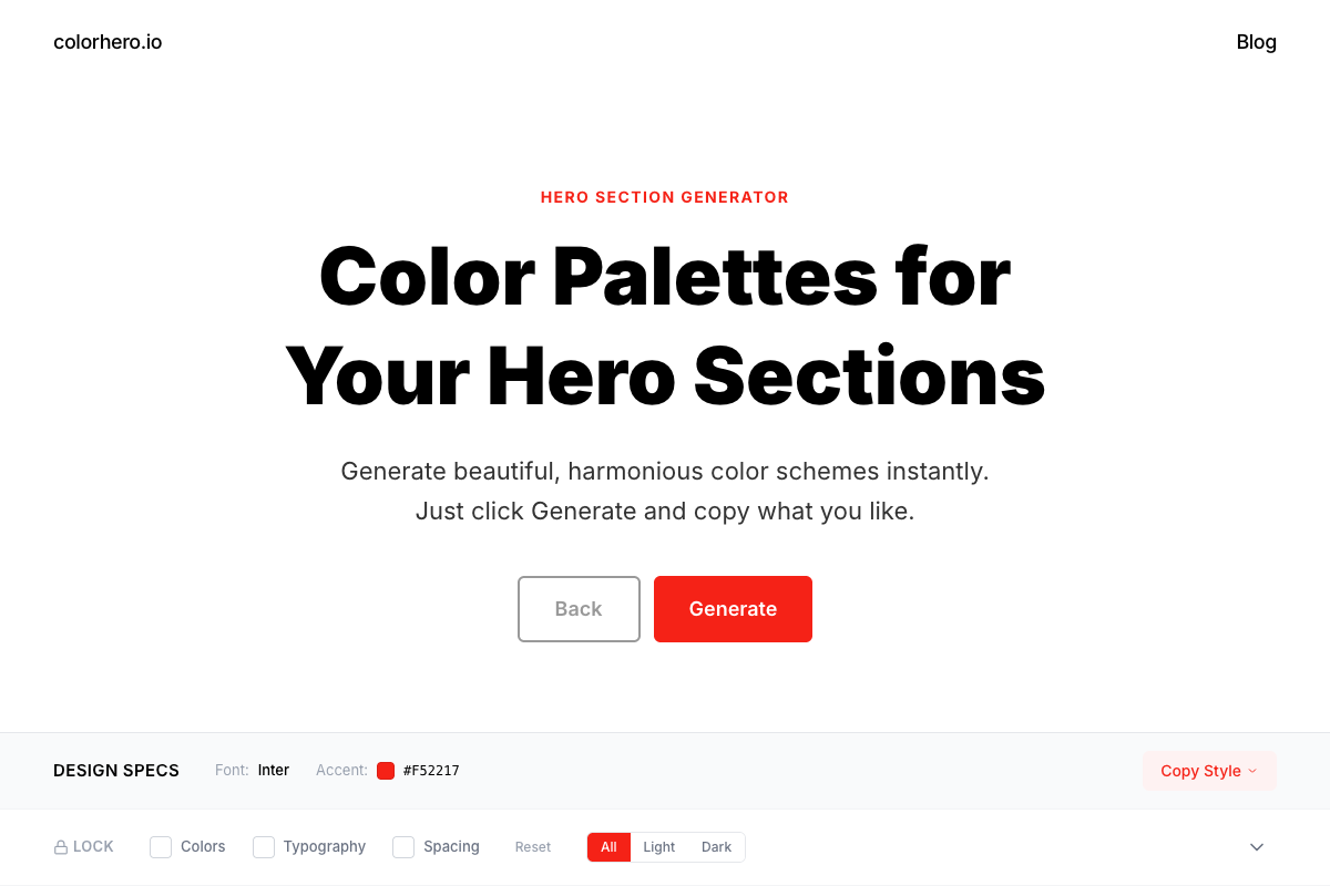
Start with a palette generator that provides role-based colors. Colorhero generates background, accent, text, and light text colors designed to work together for hero sections and landing pages. These same roles translate directly to Canva designs.
Generate a palette in Colorhero →
Step 2: Copy hex codes
Once you find a palette you like, copy the hex codes for each color. Colorhero displays hex values clearly and lets you copy them with one click. Write them down or save them in a document for reference during the import process.
- Background color hex (e.g., #FFFFFF or #1A1A1A)
- Accent color hex for buttons and highlights
- Primary text color hex for headings and body
- Light text color hex for secondary content
Step 3: Add colors to Canva
In Canva, access your brand kit or default colors section. Click the plus icon to add new colors, then paste each hex code. Name your colors by their role (Background, Accent, Heading Text, Body Text) so they are easy to identify when designing.
Step 4: Apply consistently
With your palette saved in Canva, apply colors consistently across all designs. Backgrounds always use your background color. Buttons and highlights always use your accent. Text always uses your designated text colors. This consistency builds brand recognition.
Choosing Colors for Social Media
Different social platforms have different requirements, but your core palette should work across all of them. Understanding platform nuances helps you apply your palette effectively.
Instagram feed consistency
Instagram rewards visual consistency. When your posts share a cohesive color palette, your profile grid looks intentional and professional. Use your background colors for post backgrounds, your accent for key elements, and your text colors for any typography.
LinkedIn professionalism
LinkedIn audiences expect polished, professional visuals. Neutral and corporate color palettes perform well. Avoid overly playful pastels or aggressive neon accents. Your palette should feel trustworthy and competent.
Pinterest standout factor
Pinterest is highly competitive visually. Pins need to stand out in busy feeds. Higher contrast palettes and bolder accent colors help graphics catch attention during quick scrolling. Test your palette at thumbnail size to ensure visibility.
Twitter and X quick scanning
Twitter timelines move fast. Graphics need to communicate instantly. Strong contrast between background and text ensures readability. Your accent color should draw attention to key elements without overwhelming the message.
Brand Kit Setup in Canva
Canva Pro includes brand kit functionality that saves your palette for easy access across all projects. Setting this up correctly ensures long-term consistency.
Accessing brand kit
Navigate to your Canva home screen and find Brand Kit in the left sidebar. If you have Canva Pro, you can create multiple brand kits for different projects or clients. Free users have limited brand kit functionality but can still save custom colors.
Adding brand colors
In your brand kit, find the Brand Colors section. Click to add colors and enter your hex codes from Colorhero. Organize them by role: primary colors, secondary colors, and accent colors. This organization helps when applying colors during design.
- Add your main background color as primary
- Add your accent color for highlights and CTAs
- Add text colors as secondary
- Add any additional colors you use regularly
Using brand colors in designs
Once your brand kit is set up, your colors appear automatically when you click any color picker in Canva. They show up at the top of the color selection panel, making consistent application fast and easy. No more searching for hex codes every time.
Palette Types for Different Canva Projects
Different design types benefit from different palette approaches. Match your palette style to your content type for maximum effectiveness.
Carousel posts
Carousel posts need visual continuity across multiple slides. Use your background color consistently on every slide to create flow. Accent colors can highlight key points or transitions. Text colors should remain constant throughout.
Quote graphics
Quote graphics focus on typography. Choose background and text colors with excellent contrast. Your accent color can highlight the author name or add decorative elements. Keep the palette simple to avoid competing with the words.
Promotional graphics
Sales and promotional content needs attention-grabbing colors. Bolder accent colors for call-to-action buttons and key information help drive action. Ensure the accent stands out dramatically against the background.
Infographics
Infographics need multiple distinguishable colors for data and sections. Generate a base palette, then create lighter and darker variations of your main colors. This expands your palette while maintaining harmony.
How to Build a Brand Color System in One Hour →
Light vs Dark Palettes for Canva
Choosing between light and dark base palettes affects your entire Canva design approach. Both have strengths depending on your content and audience.
Light backgrounds
Light backgrounds feel clean, professional, and approachable. They work well for most business content and ensure maximum text readability. Light palettes are safer choices when you are unsure which direction to take.
- Maximum text readability with dark text
- Professional and approachable feeling
- Works with most photography and imagery
- Easier to maintain accessibility standards
Dark backgrounds
Dark backgrounds feel modern, premium, and bold. They stand out in social feeds dominated by light content. However, they require careful contrast management to maintain readability. Use pure white or very light text colors.
- Modern, premium aesthetic
- Stands out in light-dominated feeds
- Requires careful contrast management
- Best with minimal text content
Common Canva Color Mistakes
Understanding common mistakes helps you avoid them in your own designs. These errors appear frequently in Canva creations and undermine visual quality.
Using too many colors
Canva makes it easy to add colors, so designers often add too many. Stick to your four-color palette. If you need additional colors, create tints and shades of existing colors rather than introducing new hues.
Ignoring contrast
Text that blends into backgrounds makes graphics unusable. Always verify sufficient contrast between text and background colors. If you can squint and still read the text easily, contrast is probably adequate.
Inconsistent application
Using different shades of your brand colors on different posts creates visual inconsistency. Always use the exact hex codes from your brand kit. Do not adjust colors by eye for individual posts.
Clashing with photography
When adding color overlays or backgrounds to photos, consider the colors already present in the image. Your palette should complement photography, not compete with it. Test combinations before committing.
Generating Palettes for Different Aesthetics
Different brand aesthetics require different palette approaches. Colorhero can generate palettes matching various visual styles common on social media.
Minimalist aesthetic
Minimalist brands use neutral backgrounds with one clean accent color. Generate light mode palettes in Colorhero and look for options with subtle backgrounds and refined accents. Avoid anything too bold or playful.
Bold and vibrant
Brands wanting maximum attention use high-saturation accents and strong contrast. Generate palettes and look for vibrant accent colors that pop against the background. Test at small sizes to ensure visibility.
Warm and approachable
Coaches, consultants, and personal brands often want warm, human-feeling palettes. Generate options with beige or cream backgrounds and teal, terracotta, or sage accents. These combinations feel inviting without being unprofessional.
Best Color Schemes for Personal Brands →
Maintaining Palette Consistency
Creating a palette is just the beginning. Maintaining consistency over time requires discipline and systems. These practices help ensure your Canva designs stay on-brand.
Document your palette
Create a simple brand document listing all your hex codes, color names, and usage guidelines. Share this with anyone who creates graphics for your brand. Having a reference prevents drift over time.
Create templates
Design a set of Canva templates with your palette already applied. When you need new graphics, start from these templates rather than blank designs. This ensures consistency without requiring extra effort each time.
Audit periodically
Every few months, review your recent designs side by side. Look for drift or inconsistency that crept in over time. Correct any deviations and reinforce your palette commitment.
FAQ
Can I use Colorhero palettes directly in Canva?
Yes. Generate a palette in Colorhero, copy the hex codes, and paste them into your Canva brand kit or document colors. The colors transfer exactly. Colorhero palettes work perfectly for Canva social media graphics, presentations, and other designs.
How many colors do I need for Canva projects?
Four colors is ideal: background, accent, primary text, and secondary text. This covers most design needs while maintaining simplicity. If you need more variety, create tints and shades of these four rather than adding entirely new colors.
Should I use different palettes for different platforms?
Generally no. Brand consistency across platforms is more valuable than platform-specific optimization. Use the same palette everywhere but adjust application based on platform conventions. Your accent might be more prominent on Pinterest than LinkedIn, but the colors themselves stay the same.
Do free Canva users have access to brand kits?
Free Canva users have limited brand kit features. You can save some brand colors but not full brand kits. As a workaround, save your hex codes in a separate document and manually enter them when needed. Canva Pro gives full brand kit access.
How do I know if my palette works for social media?
Test your palette at small sizes, like feed thumbnail dimensions. If colors are distinguishable and text is readable at thumbnail size, the palette will work. Also check contrast ratios using accessibility tools to ensure readability.
Get Started
Creating professional Canva designs starts with a professional palette. Generate your colors with a dedicated tool, import them into Canva, and apply them consistently across all your graphics. The result is cohesive branding that builds recognition and trust.
Generate your Canva palette with Colorhero →
Best Website Color Palettes for 2025 →
The Best Color Palette Generators Compared →
Best Color Schemes for Agencies and Creators →
Try Colorhero
Colorhero generates complete color palettes designed for hero sections and landing pages. These same palettes work perfectly for Canva social media graphics, presentations, and other marketing materials. Get background, accent, and text colors that work together beautifully, then copy hex codes directly into your Canva brand kit.